

Role
Product Designer , UX Designer/ Researcher
Tools & Research Methods
Team
Solo Project
Timeline
Industry
Food & E-commerce
Chennai's culinary landscape had a notable gap
Despite the city's diverse food scene, authentic Japanese restaurants were scarce. This wasn't just about adding another cuisine to the mix; it was also about introducing an entirely new dining concept to a market that was hungry for unique experiences.
The project's name, "Ukogi" (meaning "on movement"), was inspired by the restaurant's unique conveyor belt service model. However, bringing this dynamic experience to life through a mobile app presented unique challenges. Through initial research, I discovered that existing food delivery apps in the region often struggled with representing visual-heavy cuisines like sushi, where presentation plays a crucial role in the ordering decision.
Over four weeks in May 2022, I conducted comprehensive user research, including
11 in-depth interviews with regular food delivery app users
Competitive analysis of existing food delivery platforms
Survey of potential customers in the Chennai market
This research revealed four critical pain points
Accessibility: Users struggled to find authentic Japanese cuisine in their area
Hesitation to Try New a new cuisine: Japanese culinary terms were unfamiliar and intimidating
Usability: Existing apps didn't provide enough visual context for unfamiliar dishes
Time: Users wanted quick, efficient ordering processes despite the complexity of the cuisine
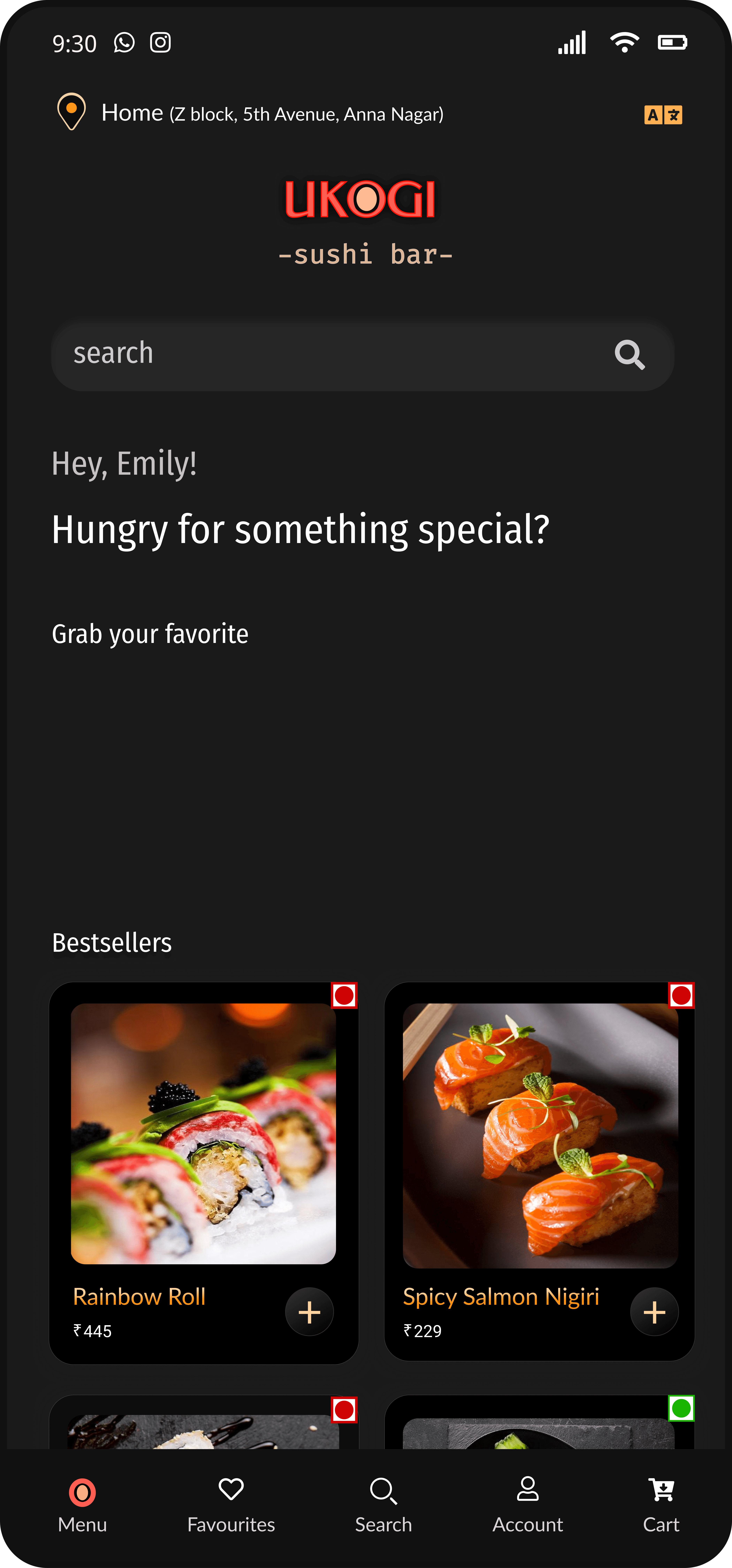
Visual-First Interface
The most significant insight from our research was that users needed strong visual cues when ordering unfamiliar cuisine. This led to the development of our hero feature: a visual-forward interface with high-quality photography and intuitive category navigation.
Key design decisions included:
Large, professionally shot food photography that accurately represents each dish
Clear categorization with both icons and text labels
Prominent nutritional information and ingredient listings
Interactive elements that mirror the physical conveyor belt experience
Intuitive Navigation
I implemented a category-based navigation system with familiar sushi types:
Salmon Roe
Nigiri
Uramaki
Maki
Each category features an iconic visual representation, making it easy for newcomers to identify and explore different sushi styles.
Detailed Product Pages
The product detail view was designed to address the language barrier and unfamiliarity with Japanese cuisine:
Clear pricing and portion information
Detailed descriptions in simple, accessible language
Nutritional information presented in a scannable format
Customization options clearly indicated
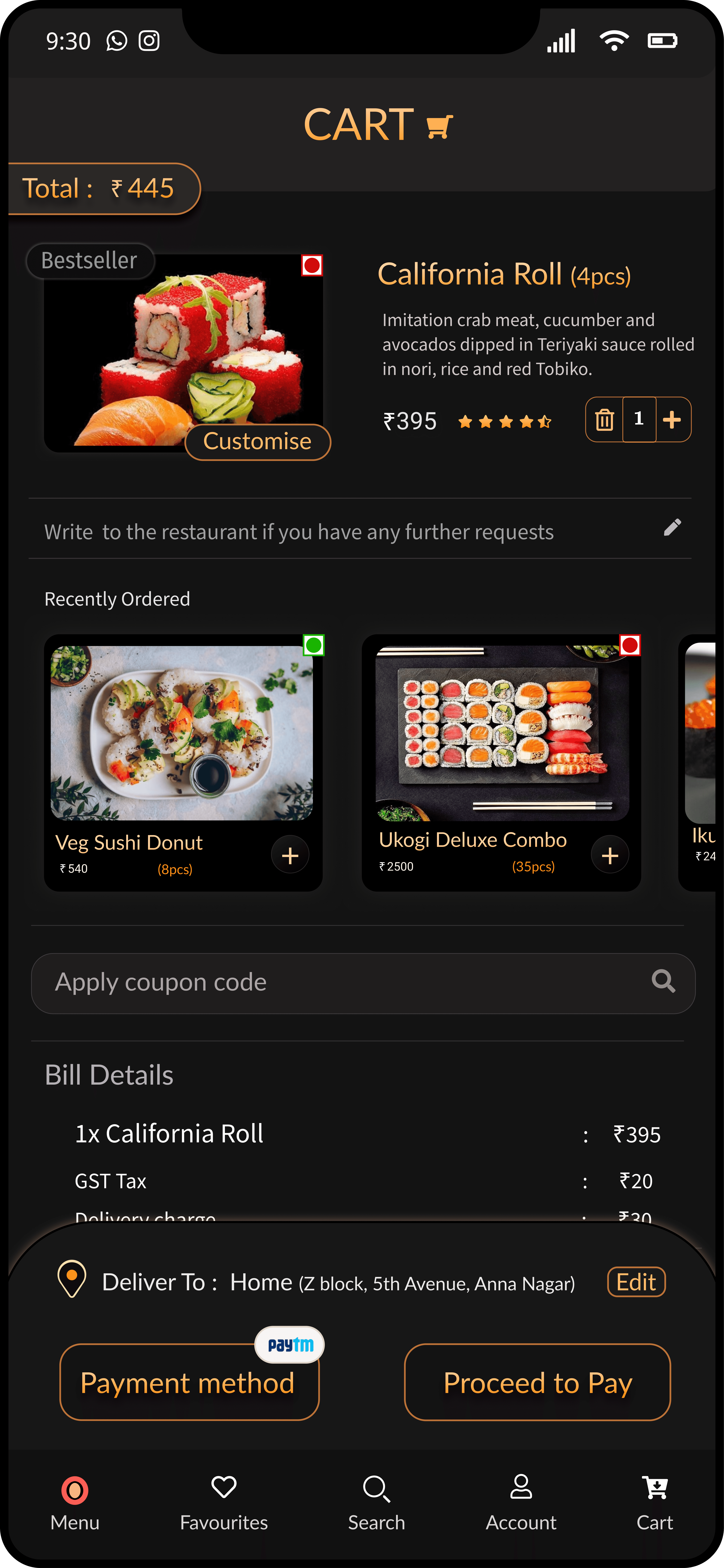
Streamlined Cart Experience
The cart and checkout process was optimized for efficiency:
Real-time order total updates
Clear breakdown of costs including delivery charges
Multiple payment options
Easy address modification
Impact and Results
The User Testing of the Ukogi app with over 35 users demonstrated significant success
85%
of test users completed their first order without assistance
40%-
Average time to complete an order reduced by 40% compared to similar apps
28+
positive feedbacks on the visual presentation of dishes
78%
of users reported feeling confident in trying new Japanese dishes
This project taught me several valuable lessons
In food delivery apps, high-quality visuals aren't just aesthetic choices - they're essential functional elements that help users make informed decisions.
Designing for a new cuisine in a market requires deep understanding of both the source culture and the target market's preferences.
Despite the perception of complexity of Japanese cuisine, users responded best to clean, uncluttered interfaces that prioritized visual information.
If given the opportunity for future iterations, I would focus on
Implementing AR features to show 360° views of dishes
Adding a learning section about Japanese cuisine and dining customs
Developing a loyalty program tied to the conveyor belt concept
Creating a social sharing feature for favorite dishes


