Case study
OncoTXCare
AI-assisted treatment decision support for complex oncology cases
I designed a decision-support concept that brings patient history, treatment options, multidisciplinary input, patient preferences, insurance constraints, drug information, and clinical trials into the same oncology workflow.
Role
Product Designer
Work
Discovery synthesis, product scoping, information architecture, interaction design, visual design, prototyping
Domain
Oncology / Clinical decision support
Prototype
Figma
Patient context
Current decision point

01 · Where it started
Peggy’s case exposed gaps in the information surrounding a treatment decision
We started with Peggy.
Peggy was 29, pregnant with her first child, and had previously been treated for breast cancer. During her pregnancy she developed neurological symptoms. Imaging later revealed tumors in her brain and lung, and the original cancer classification became an important part of understanding what had gone wrong.
What interested me from a product perspective was not only the diagnosis itself. It was how many pieces of information had to work together around it.
The original use-case documentation identified missing symptom tracking, missing clinical flags, fragmented treatment information, and no clear history of what had been decided and why.
Peggy’s case, reconstructed
01
Previous breast cancer
Treated before the pregnancy
02
Pregnancy
First child
03
New symptoms
Neurological
04
Imaging
Tumors in brain and lung
05
Conflicting or missed information
Original classification revisited
06
Treatment decision
Where it all converges
Information gaps around those moments
Missing symptom tracking
Around the new symptoms
Missing clinical flags
Around pregnancy and imaging
Fragmented treatment information
Around the earlier treatment
No clear history of what was decided and why
Around the treatment decision
02 · Discovery
A month of domain mapping expanded the problem beyond the clinical encounter
Peggy gave us one case to begin with. I then spent a month working with a clinical research and healthcare operations expert with oncology experience to understand what happens around oncology care more broadly.
The problem expanded quickly.
Treatment decisions touched clinical records and biomarkers, but also tumor-board coordination, clinical trials, insurance and prior authorization, pharmacy, documentation, administration, patient preferences, compliance, operational handoffs, and follow-up.
The original product documentation reflects that breadth too. The early concept connected patient records with manual information capture, treatment planning, insurance coverage and flags, drug and trial options, decision history, and outcomes.
everything pointed here
Treatment decision
The map from the month of discovery, redrawn here for legibility.
03 · Scope
We chose to design the treatment-decision workflow instead of another all-in-one oncology platform
The research did not leave us with one neat problem. It left us with too many.
Trying to solve insurance operations, pharmacy, administration, clinical documentation, care coordination, treatment planning, trials, and the EHR itself would have created another enormous healthcare system.
So I narrowed the first product concept around the point where much of that information converged: the treatment decision.
The scope became
01
Understand the patient
02
Understand how the case reached this point
03
Compare possible treatment paths
04
See what influences each option
05
Bring in relevant drug, trial, and access information
06
Keep the final decision with the care team and patient
Adjacent problems stayed in the product only when they changed that decision.
Mapped, but not the core product
Hospital administration
Complete payer workflows
Pharmacy operations
EHR replacement
Organization-wide compliance
In scope for the prototype
Patient context
Treatment pathway
Decision support
Patient preferences
Drug intelligence
Trials
Contextual AI
04 · Patient record
The patient record brings clinical history, current status, patient preferences, alerts, and insurance into one view
The top of the record establishes the patient’s current diagnosis, biomarkers, treatment status, and basic context. Below that, I separated the rest of the information by the question it answers.
What has happened?
Medical history and treatment tracker.
What matters to this patient?
Treatment preferences, quality-of-life priorities, autonomy, goals, refusals, and communication preferences.
What could block or change the plan?
Recent alerts and insurance coverage.
What needs another look?
Clinical insights.
One thing from the original Peggy workflow that influenced this was the need to capture information that might not already exist cleanly in an EMR. Early requirements explicitly included symptom onset, interventions, outcomes, and clinical flags that could feed back into treatment planning.
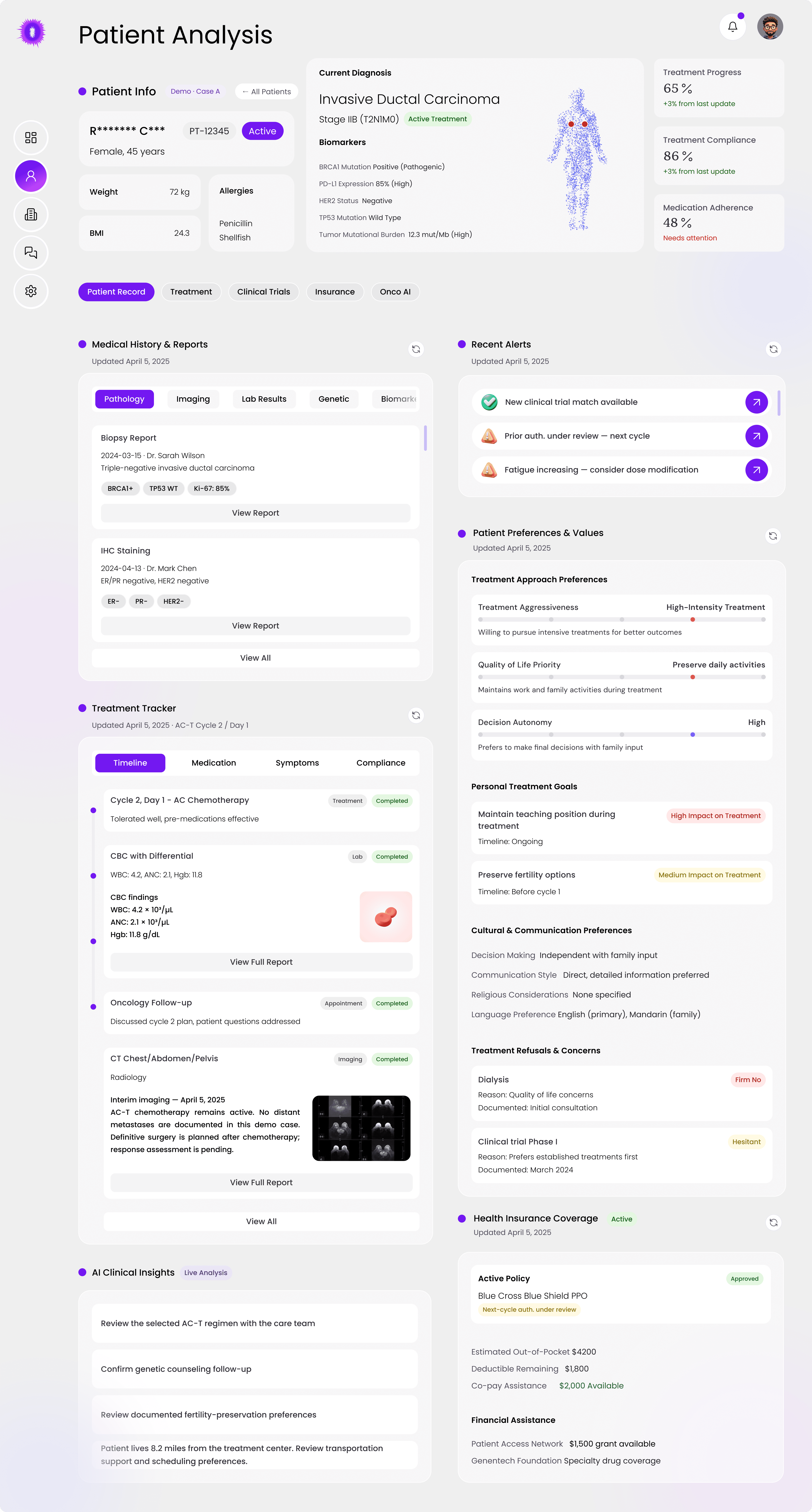
The full patient record
What has happened?
What could block or change the plan?
What needs another look?
05 · Design decision
I structured patient preferences as part of the decision context instead of leaving them in free-text notes
The prototype treats preferences such as treatment aggressiveness, quality-of-life priorities, decision autonomy, personal goals, communication preferences, and refusals as structured information.
I chose that over burying them in an open-ended note because they may affect how otherwise reasonable treatment options are discussed and compared.
Free-text note
Wants to keep teaching if possible. Worried about fertility. Family should be involved in decisions. Not keen on dialysis or early-phase trials.
Illustrative, written from the structured preferences in the prototype
Structured patient context
06 · Treatment pathway
The treatment pathway shows how the case reached the current decision, not just what the system recommends next
Instead of landing on an isolated recommendation, the clinician can see the history that produced the current question.
This also reflects an early requirement from the Peggy concept: clinical decisions needed dates, decision criteria, status, and a history that future teams could revisit.
Pre-screening
Primary treatment
Recurrence and crisis
Current decision point
07 · The centerpiece
The current decision point compares treatment options with the evidence and constraints attached to each one
The prototype compares multiple paths in the same view rather than discussing them one after another.
The early product concept already framed treatment planning as multiple options, including palliative, conservative, aggressive, and experimental paths, with insurance overlays and connections to drug intelligence and prior authorization. The design evolved that concept into one comparison surface.
What each option can surface
01
Clinical evidence
02
Guideline alignment
03
Patient factors
04
Insurance / authorization
05
Proposed drugs
06
Clinical-trial path
07
Recommendation score
One option, up close
08 · Recommendation score
I kept the recommendation score next to its contributing factors so it could be questioned, not simply accepted
The prototype includes recommendation scores, but I did not want the number to become the interface.
The score remains next to the evidence categories and patient or access factors represented in the design. The user can move from “what is ranked highest?” to “what is behind that ranking?”
The design decision
Never separate the score from the information needed to interrogate it.
Option B: the 55% score sits in the same row as its evidence, guideline, patient and insurance factors.
09 · Drug information
Drug information expands inside the treatment option so clinicians do not have to reconstruct the case elsewhere
Each option lists its proposed drug regimens. Opening them shows dose, schedule, efficacy score, and toxicity risk for each drug, with alternatives, drug interactions, and side effects one tab away.
All of it opens inside the option being discussed, so the patient, the pathway, and the other options stay in view.
What opens inside the option
01
Proposed drug regimens
02
Dose and schedule
03
Efficacy score
04
Toxicity risk
05
Alternative treatment options
06
Drug interactions and side effects

Option A, expanded. The regimens open inside the option they belong to.
Design choice
Drill down inside the decision instead of sending the user into a separate research workflow.
10 · Clinical trials
Clinical-trial matching shows both the result and why the patient qualifies
The clinical-trials view starts with the count, 47 trials screened and 3 currently eligible, and then shows the reasoning behind it: the matching criteria, how the screened trials break down by eligibility, and where enrollment and the waitlist stand.
Additional candidates that still need an eligibility review are listed separately, so they are not mistaken for matches.
The view reads in this order
01
47 trials screened
02
3 currently eligible
03
Matching criteria
04
Eligibility breakdown
05
Enrollment
06
Waitlist
07
Additional candidates

The count, the criteria behind it, and the eligibility breakdown.
Enrollment and waitlist status for the matched trials.
The design principle
A trial match should not appear as a mysterious search result.
11 · AI assistant
The AI assistant starts from the active patient and treatment context instead of asking the clinician to explain the case again
When the assistant opens, it already names the patient, the diagnosis, the biomarkers, and the current regimen, and says what it found for this case.
Its suggested questions are about the options already on screen, not general prompts.
Suggested questions in the prototype
“Are there alternative options?”
“What evidence supports this approach?”
“What are potential side effects?”
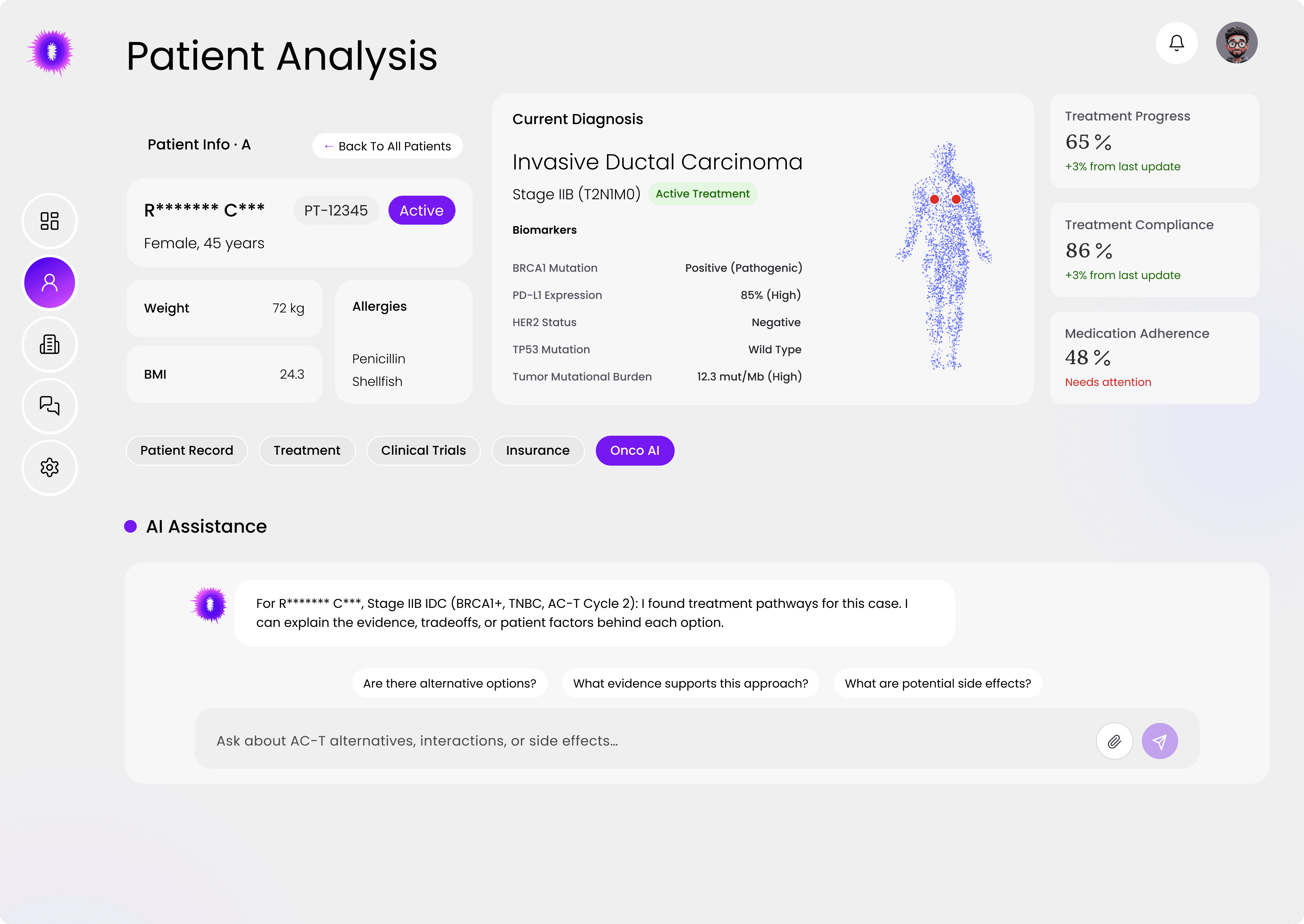
The assistant opens on the active case, with its context written into the first message.
Context persistence
A generic assistant makes the clinician restate the problem. This one begins from the case.
12 · Human decision
The prototype keeps the treatment decision explicit even when AI is involved
Scores, drug information, trial matches, and the assistant all inform the choice, but none of them make it. The decision point states that a patient decision is required and by when, and the decision is recorded through a deliberate action on the chosen option.
Patient decision required, a decision target date, and Record Treatment Decision on the option itself.
13 · Scope, revisited
The final prototype covers the decision layer, while full payer, pharmacy, EHR, and hospital operations remain outside its scope
Back at the original map, several neighboring areas stayed visible in the prototype as context, without the prototype trying to own them.
Remained visible as context
Insurance status
Prior authorization
Drug information
Clinical trials
Patient preferences
Did not attempt to become
A full payer-management product
A pharmacy operations system
An EHR replacement
A hospital administration platform
14 · What this is
The result is a testable decision-support concept, not a clinically validated treatment system
The prototype is specific enough to put in front of clinicians and learn from. It is not evidence that the approach improves care, and I do not present it that way.
What exists
A Figma prototype built around one fictional demo case
A decision layer that connects the patient record, treatment pathway, options, drug information, clinical trials, and AI assistance
Interaction patterns that can be tested with clinicians
What we do not have
No clinical efficacy claim
No measured patient outcome
No validated AI accuracy claim
15 · What I would test next
The next research question is whether clinicians can understand the recommendation faster without becoming over-reliant on it
I would test
01
Whether clinicians can explain why an option ranks highest after reviewing it
02
How quickly they reach the evidence behind a recommendation score
03
Whether the score changes how much attention lower-ranked options receive
04
Whether patient preferences are noticed and used when options are compared
05
Whether answers from the assistant are checked against the source information or accepted as given
16 · Reflection
My takeaway
In most products, simplifying a screen usually makes it easier to use. In healthcare, simplifying too aggressively can also hide something important. I found myself asking different questions throughout this project: What needs attention first? What can wait? What should stay visible even if it is not the primary task? What happens when two pieces of information conflict?
That made me less interested in making every screen feel “clean” and more interested in making the right things impossible to miss.
The biggest lesson for me was that complexity is not always something to remove. Sometimes the better design is the one that organizes it carefully enough for people to understand it and still make their own judgment.